Color is more than just a visual element of our surroundings; it plays a significant role in how we experience and interact with our spaces. At Eastside Design & Build, we understand that the colors chosen for your home are not just about style or trends—they can influence your mood, thoughts, and even your well-being. Let’s delve into how different colors can transform your home environment and affect daily life.
The Psychology of Color
Color psychology is the science of how color affects human behavior and mood. While the effect can vary depending on personal experiences and cultural contexts, some general trends have been observed and utilized in interior design:
- Blue – Calmness and Serenity: Blue is often associated with calmness and serenity. It is believed to lower blood pressure and slow down heart rate, which is why blue tones are frequently used in bedrooms and bathrooms. Lighter blues can make a room feel more spacious and airy, while darker blues can give a sense of stability and depth.
- Yellow – Energy and Happiness: Yellow is the color of sunshine and is commonly linked to happiness and liveliness. Using yellow in a kitchen or dining room can create an energetic atmosphere, perfect for social gatherings or busy family breakfasts. However, it’s important to choose the right shade as very bright yellows can be overwhelming.
- Green – Balance and Harmony: Green is the color of nature and is easiest on the eye. It promotes balance and harmony and is therefore a great choice for almost any room in the house. In particular, green has a soothing effect which makes it perfect for a home office or a child’s play area.
- Red – Passion and Appetite: Red is a powerful color that evokes strong emotions. It increases energy levels and can stimulate appetite, making it a popular choice for dining rooms. However, because of its intensity, it’s best used as an accent color to avoid overwhelming a space.
- Purple – Creativity and Luxury: Purple is traditionally associated with luxury, wisdom, and creativity. It’s a great choice for a personal retreat or creative space, such as a home office or art studio. Lighter shades like lavender help to relax the mind and allow for contemplation.
- Neutral Tones – Flexibility and Sophistication: Whites, beiges, and grays are popular for their versatility. Neutral walls can make a small room feel bigger and brighter, as they reflect more light. Neutrals also allow for easy redecoration because they match almost any color, providing flexibility as your style evolves.
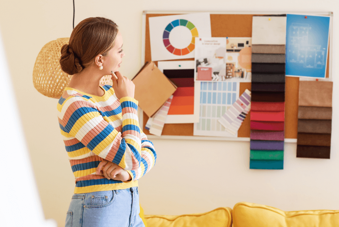
Tailoring Colors to Your Space
Choosing the right colors for your home involves considering the size of the rooms, the amount of natural light, and the function of each space. For instance, a study or home office would benefit from calming colors like blue or green, which can help concentrate the mind. In contrast, vibrant colors like orange and red might be more suited for areas that foster activity and creativity, such as a workout room or game room.
Additionally, the way colors are applied can also have an impact. For example, a bold color on all four walls might be overpowering, but the same color on an accent wall can offer a pop of energy without overwhelming the senses.
At Eastside Design & Build, we specialize in creating environments that enhance your lifestyle through thoughtful design. Whether you’re renovating a single room or transforming your entire home, we can help you select colors that will enhance your mood and complement your living environment. Get in touch with us today to see how we can help bring your vision to life through color.